As you might have noticed, Facebook is changing its design. Where some of us have the possibility to switch between the old and new layout, some of us are in the ‘New’ and have no option to switch back anymore.
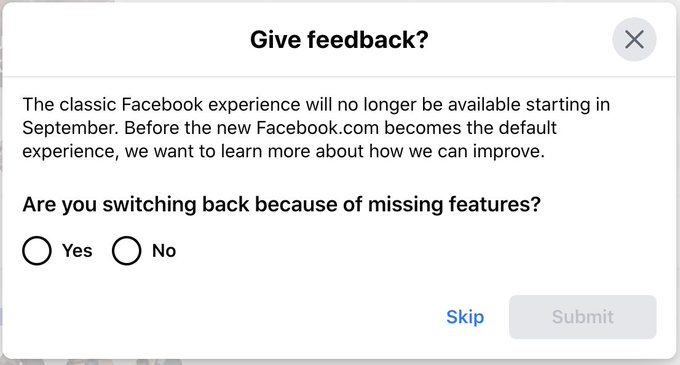
From September 2020, Facebook will only show you the New design. So for the couple of days left; which design is better for OSINT investigations?
How to see the New Facebook
Login to Facebook and use the triangle button in the top right to choose ‘Switch to New Facebook’.
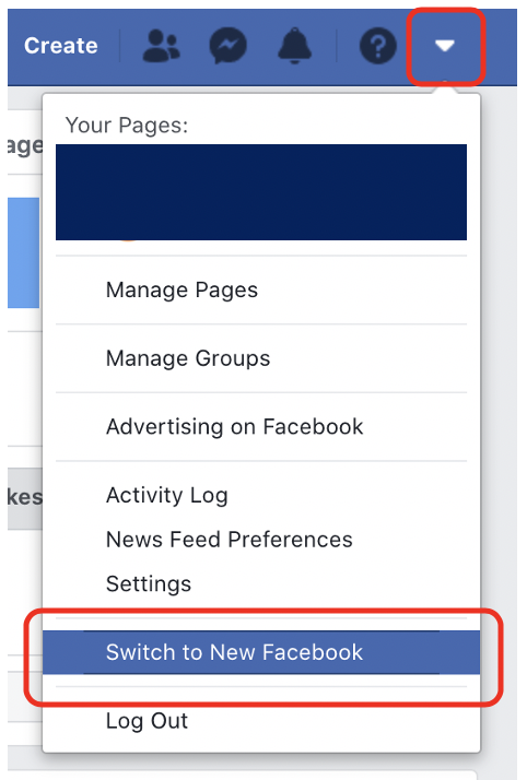
When you’ve switched layouts, you can easily switch back to ‘Classic’ by choosing the triangle button in the top right again and select ‘Switch to Classic Facebook’.
You don’t see this option? Then your profile might not be selected to see the New Facebook yet. You don’t have any option to switch back to Classic? Then your profile is now ‘stuck’ in the New. As from September it looks like we’re all ‘stuck in the New’. But there are some good options there too! Continue to read to find out!
Finding ID numbers of profiles: Classic vs New
Finding ID numbers can be important for when you want to do some advanced searching (want to do advanced searching? Check out our first and second blog!) or when you need to request data from Facebook when you’re in Law Enforcement. Finding these ID numbers in the old and new design is different. The table below shows what you’ll need to search for in the source code in order to find the right ID.
| ID from: | classic design | new design |
|---|---|---|
| Profile | entity_id | userID |
| Page | entity_id | pageID |
| Location | entity_id | Things-to-do-in (first number after this line) |
| Event | ID is displayed in the URL | eventID |
| Group | entity_id | groupID |
Posts: Classic
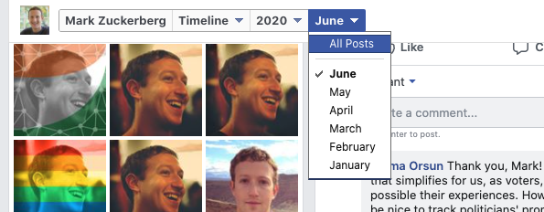
Looking for any specific posts? Use the Classic design. In the New design (as shown right) you can’t specify the time range but month anymore, only by year.
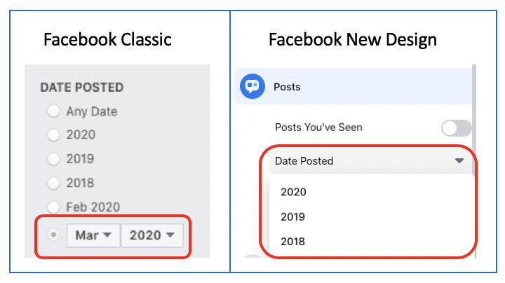
If you want to specify searching by date even more precise, for example: posts between 1/1/2020 and 4/3/2020, use the JSON/Base64 method as explained in our previous blog.
Facebook Marketplace: Classic
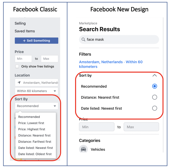
Use Facebook Classic to search the ads/classifieds on Facebook Marketplace. Go to Facebook.com/marketplace to see more filter options in the menu on the left side than you do when you look at the Marketplace in the New design.
Places or locations: New
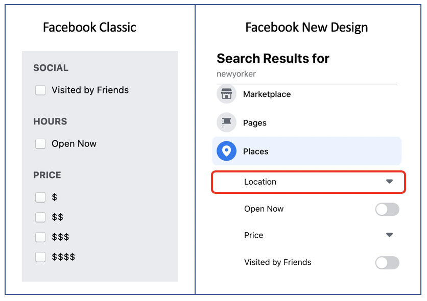
Looking for places or locations like restaurants, hotels, etc? Use the New design. You’ll sometimes get an extra filter option ‘Location’. This can be helpful when you’re looking for a specific place, let’s say a restaurant, which may have more franchises world-wide.
Groups: New
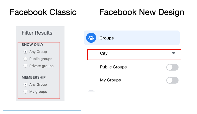
If you’re searching for a particular group, choose the New design. The New design also gives you the extra filter option to filter by city.
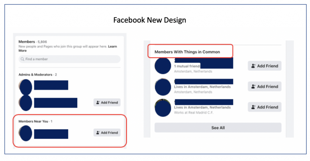
Looking at the members of a group in the New design gives you some nice information about members who might have a connection with your profile. Like they might be near to your location or have a friend or thing in common. This is something that’s not shown in the classic design.
Date group joined: Classic
Attention: this only works in Groups that are in the ‘Buy & Sell’ category!
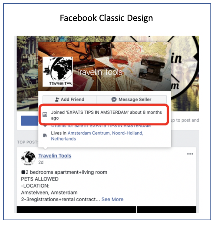
Use the Classic design to see when someone became a member of the group. Find a post, hover over the profile that posted it (do not click!) and a menu will appear which shows how many months or years ago someone joined the group. This is not shown in the New design.
Group created: Classic
If you want to know the exact date a Group was founded, use the Classic design because you’ll be able to see the exact day, month and year where in the New design you just see the month and year. And, if you’re lucky, the Classic design sometimes also shows who founded the group. This is not always displayed because someone can choose to remove their profile.

Events in groups: Classic
If in the Group any Events are created and you want to view them; use the Classic design as there is an option to view the ‘Calendar’. This also gives you the option to view any past Events. The option ‘Calendar’ is not shown in the New design.

Documents shared in a group: Classic
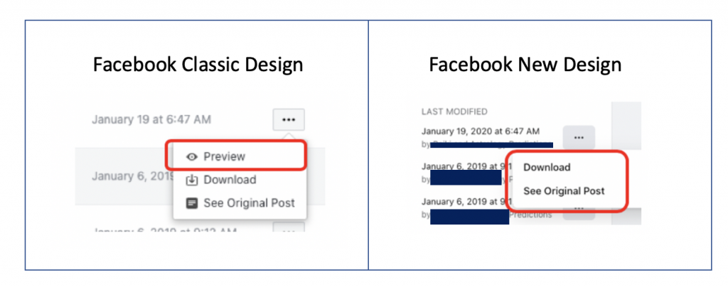
There is the possibility to share Documents within a Group, but only in the Classic design you get the option to see a preview of the document.
Searching events: New
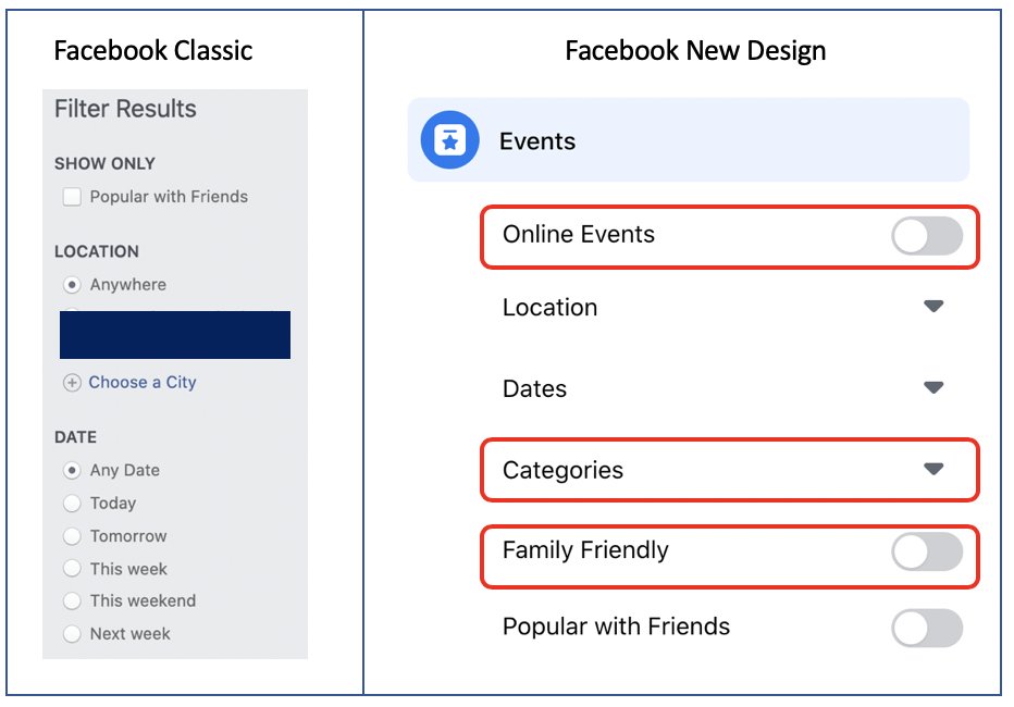
Definitely use the New design when looking for Events. You’ll have 3 extra filter options: Online Events, Categories and whether an Event is marked as Family Friendly.
Event attendees: Classic & New
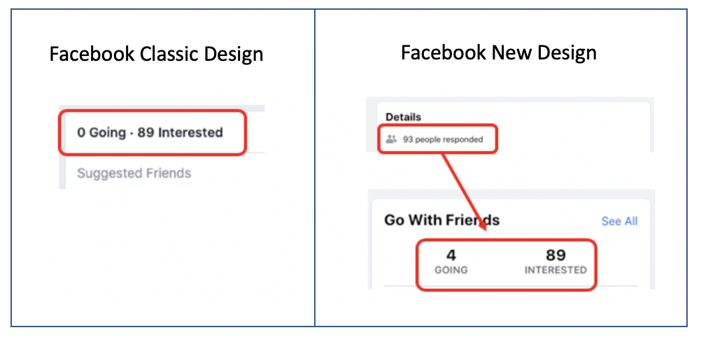
If you’re interested in how many people are attending an Event, switch between Classic and New. In the New layout, you sometimes see a little more details about the people attending.
Profile timelines: Classic & New
When you’re looking at a profile and there is so many posts there and you want to focus on just the posts between November 2018 and December 2018, you might want to consider using the Classic design. When you scroll down on a profile, a menu bar will appear at the top and it gives you the opportunity to filter by month and year.
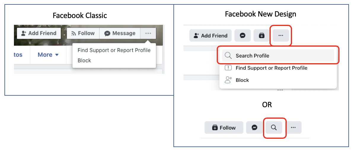
But if you’re looking for posts about a specific topic, e.g. COVID, between January 2020 and March 2020, you might want to use the New design. In the New design you can choose the option to search within the profile, as shown on the right in the image below.
Profile following/followers: New
No friends shown on a profile? Always click on the ‘Friends’ button because you might be able to see the ‘Following/Followers’ of a profile. If you want to search within these accounts but the list is very long, choose the New design, because you’ll have an extra search bar to make it more easy for you.
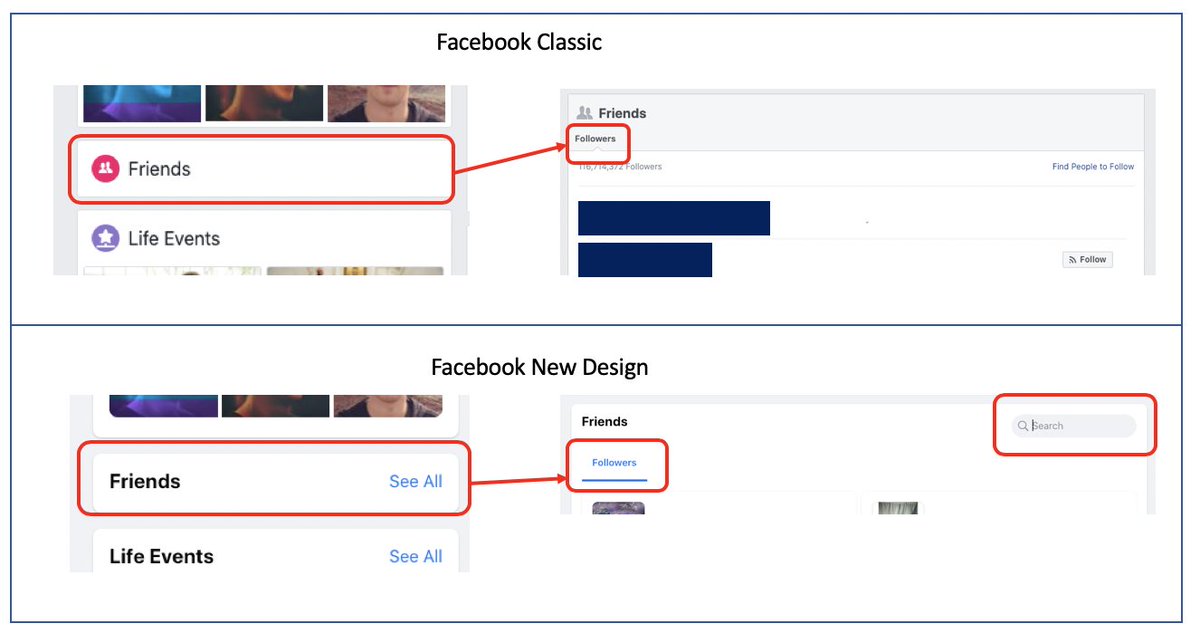
Did know that ‘Following/Followers’ can be filtered when you are looking at their friend list? You’ll see and extra tab displayed just above that list.

Check-ins: Classic
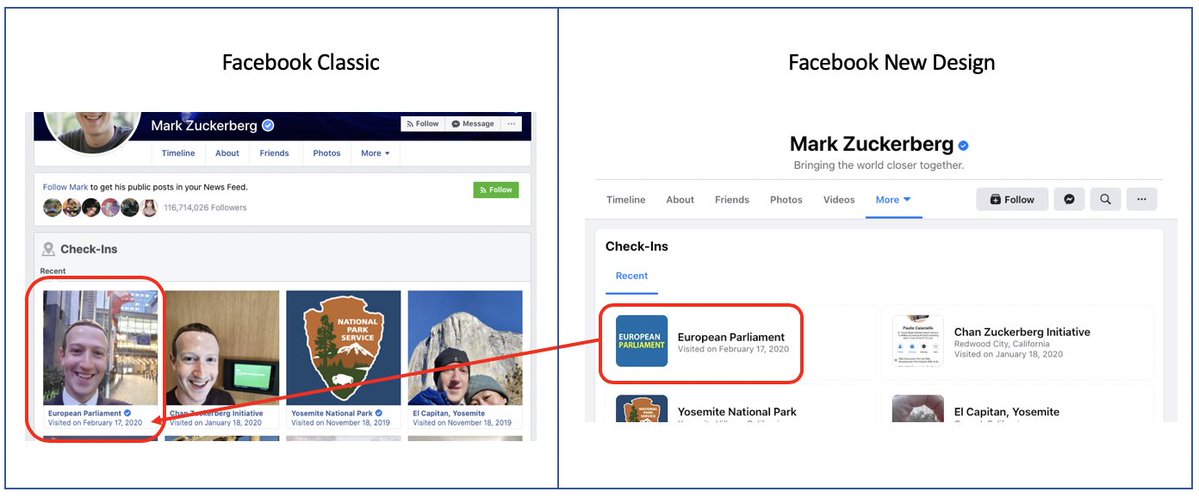
Use the Classic design if you’re looking at check-ins of a profile. In the classic layout you can see which post matches a particular check-in. In the New design you can only see where someone has checked-in, but not the related post.
Search inside a page: New
When you want to search for specific posts on a page, use the New design. As explained in the ‘People’ category, you’ll have an option to search on the particular page by using the little magnifying glass icon.

If you want to search within a page using the Classic design, simply use the top search bar, type what you’re looking for, select the category ‘Posts’ and choose the filter option ‘Posts from’ in the menu on the left. Then, type the name of the page under ‘Choose a source…’. Is your page not in the research results? Then you may have to use the JSON/Base64 method to search specifically on that page. This method is explained in our previous blog that you can find here.
About section: Classic
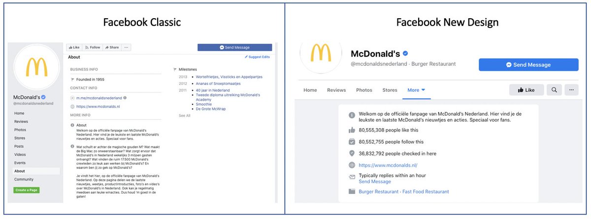
If you’re looking at the ‘About’ section on a page, use the Classic design. You’ll be able to see more information than in the New design, like for instance the ‘mile stones’ of a page.
And the winner is…
You could say that for now the Classic design gives you the overall best results. But, depending on what you’re looking for, you might want to consider using the New design. Take a look at the table below and ask yourself what it is you want to find or see on Facebook, and see which design would work best for your goal.
| Part on Facebook: | classic design | new design |
|---|---|---|
| Searching for: | ||
| Posts | X | |
| Marketplace | X | |
| Places | X | |
| Groups | X | |
| Events | X | |
| Viewing profiles: | ||
| Timeline | X | X |
| Followers | X | |
| Check-ins | X | |
| Viewing pages: | ||
| About: | X | |
| Viewing events: | ||
| Attendees | X | |
| Viewing groups: | ||
| Members | X | |
| Members – registration date | X | |
| Date of incorporation | X | |
| Events | X | |
| Documents | X |
Note: As of September, Facebook will show the New design. The above named examples in the Classic design might not be visible anymore.
Want more on Facebook?
Check out our part 1 and part 2 on how to do Facebook Graph searches (which still work in the New design, whoohoo!) or watch our webinar on How To Search On Facebook.

